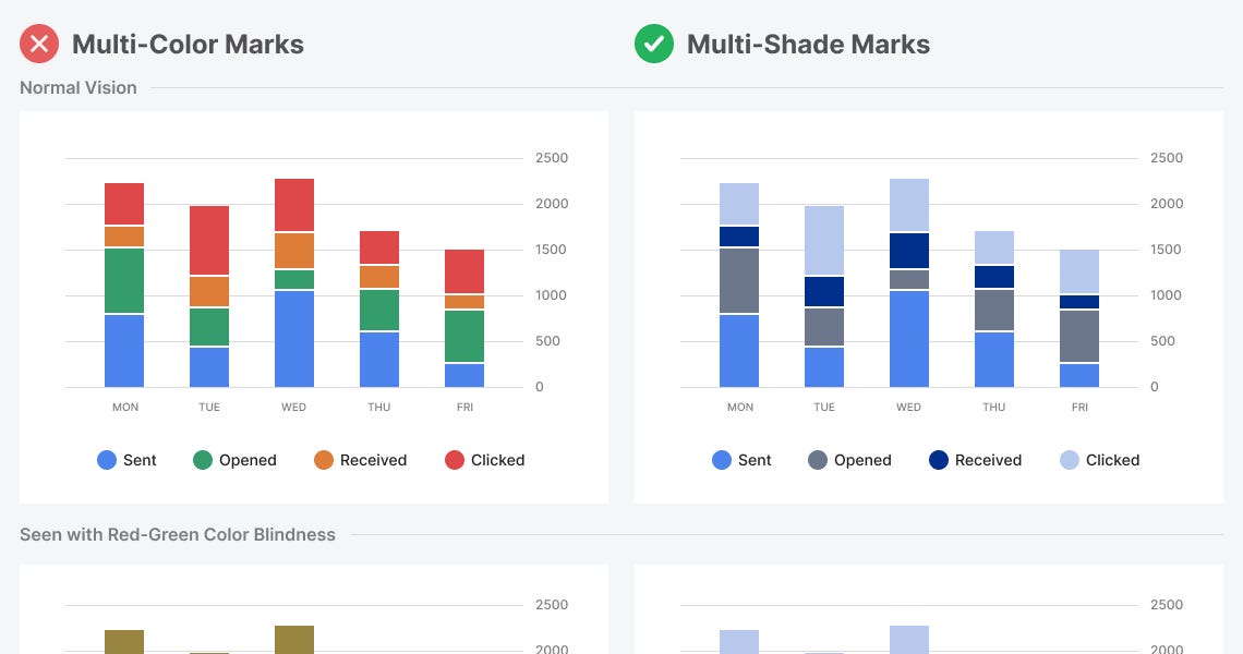
Why Multi-Color Charts Are Inaccessible

Metadata
Highlights
Designing for Colorblind Users
Quote
To make your charts accessible to colorblind users, don’t use different hues. Instead, use the same hue but vary the saturation and brightness. Doing this will create various shades of the same color with a preserved contrast. (View Highlight) #✂️